Component — Feature Card Links
Feature Cards are single cards that will be display across the entire width of your content area. There are 3 Feature Cards — a Feature Card with an image, a Feature Card with text only and a Feature Card with a set of links. We will be looking at the Feature Card with Links in this tutorial.
» View some Feature Card examples
Creating Your Feature Card — with Links
Your Feature Card will be composed of a number of parts. You will add these parts individually and then we will put them together for you to create the card.
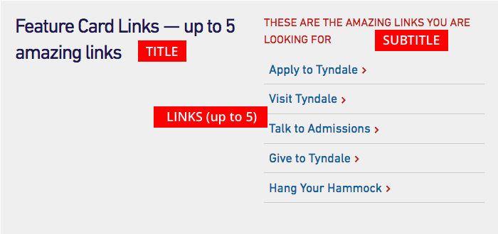
Feature Card Title and Subtitle
You have the ability too add both a title and subtitle to your Feature Card. The main title should be short and clear. The subtitle is optional and appears above the list of links as smaller red text and is displayed in all capital letters.
Adding Your Links
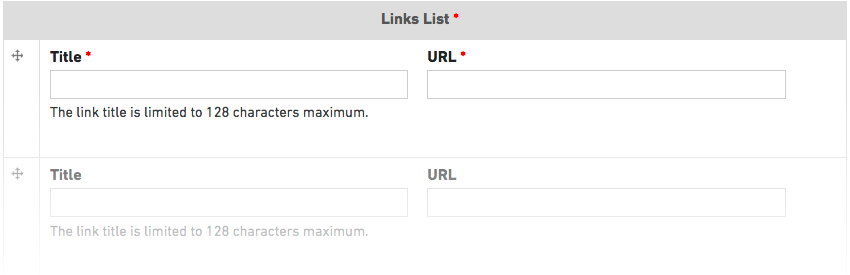
You can add up to 5 links to your Feature Card. For each link you will need to add a link title (maximum 128 characters) and the URL (website address) you are linking to. Please make sure you add the full URL which includes “http://…” — it is easiest to navigate to that page and then copy the URL from the address bar of your browser. It is best practice to test all of your links before you submit your page for review.
You can reorder the links using the cross to the left of each of your links as you are adding them.
While it is possible to add only one or two links, this Feature Card works best with three to five links. If you only have one link, you may want to consider using a different Feature Card option.