Component — Feature Card Text
Feature Cards are single cards that will be display across the entire width of your content area. There are 3 Feature Cards — a Feature Card with an image, a Feature Card with text only and a Feature Card with a set of links. We will be looking at the Feature Card with text only in this tutorial.
» View some Feature Card examples
Creating Your Feature Card — Text
Your Feature Card will be composed of a number of parts. You will add these parts individually and then we will put them together for you to create the card.
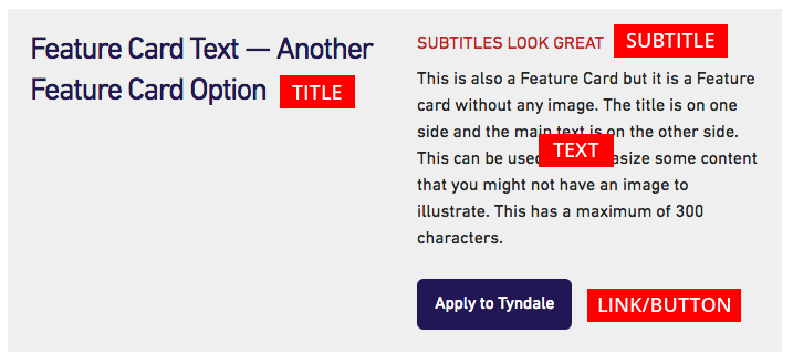
Feature Card Title and Subtitle
You have the ability too add both a title and subtitle to your Feature Card. The main title should be short and clear. The subtitle is optional and appears above the main text as smaller red text and is displayed in all capital letters.
Feature Card Text
Your Feature Card text needs to short and to the point — this field is limited to 300 characters. The text that is in this field is just plain text, you will not be able to add any styling or links.
Button (link and title)
If you would like, you can add a button to your feature card. The button is created from two pieces of information — the URL (website address) you are linking to, and the text you would like on the button. Please make sure you add the full URL which includes “http://…” — it is easiest to navigate to that page and then copy the URL from the address bar of your browser. It is best practice to test all of your links before you submit your page for review.
The text for your button title should be clear and short. This field is limited to 40 characters.