Component — Cards Set / Cards
The "Cards Set" component is a little different from the other components in that it is a container for another component called "Card". Adding a "Cards Set" will allow you to add a number of individual "Card" components. The Card Set also has some options for how the cards contained in it should look or behave.
Creating a Cards Set
Choose “Cards Set” as your Page Component Type and then click on the button labeled “Add new Page Component”. Note that if you already have some component on your page, the button will read “Add another Page Component”.
The Cards Set options will appear allowing you to set the style for this set of cards. Please note that all cards in the same set will share the same style.
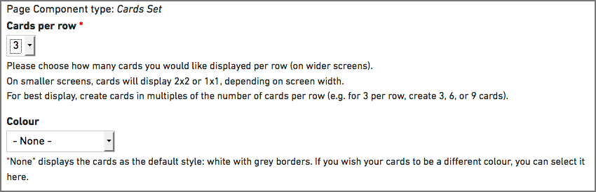
There are two choices you need make for your cards set — how many cards would like like in each row, and what colour scheme you would like your cards to use.
Cards Per Row
Cards can appear in either two or three cards per row even if you have more than that set number of cards. For example, if you have more than two cards in a set of two, the third card will wrap to a new line and continue in sets of two. For best results, create cards in multiples of the number of cards per row (example, for 3 per row, create 3, 6, or 9 cards).
On mobile devices (like phones), the cards will display stacked on top of each other in the same order you place them.
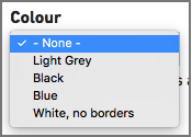
Colour
 Cards will display with the default colour scheme if no choice is made — the default is a white card with grey borders. If you would like to have your cards look different from the default, you can choose from a selection of colour options.
The colour represents the background colour of the card itself. Each of the colour options is designed in a way that adheres to accessibility standards for colour contrast. Please not that all cards in the set will share the same colour option.
Creating Cards
Now that you have setup your set of cards, we can create all of the individual cards for this set. Cards are composed of a number of parts — the card image (and alternative text), the card title, the text for the card, and the card link/button.
Card Image and Alternative (ALT) Text
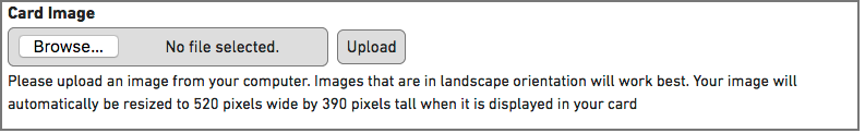
You can upload an image from your computer for each card. Using landscape oriented images works best. You can upload any image up to 10mb in file size, your image will automatically be resized to 520 pixels wide by 390 pixels tall when it is displayed in your card.
Please make sure you remember to add descriptive alternative text to your image. This text will be used by screen readers, search engines, or when the image cannot be loaded. For guidelines on writing good alt text, please see the documentation on adding alternative text for images.
Images are optional for cards.
Card Title and Text
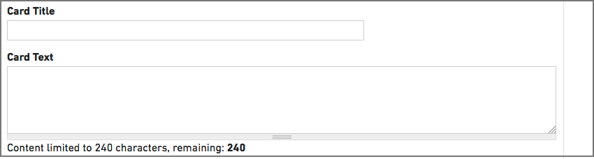
Add a simple title to your card. We would recommend having shorter titles. Longer titles will wrap to the next line of text and may look odd. It looks best when all titles are similar in length, especially if they wrap to a new line.
Your card text needs to short and to the point — this field is limited to 240 characters. The text that is in the card is just plain text, you will not be able to add any styling or links to this text. It also looks best when all text blocks are similar in length.
Button (link and title)
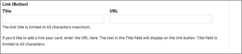
If you would like, you can add a button to each card. The button is created from two pieces of information — the URL (website address) you are linking to, and the text you would like on the button. Please make sure you add the full URL which includes “http://…” — it is easiest to navigate to that page and then copy the URL from the address bar of your browser. It is best practice to test all of your links before you submit your page for review.
The text for your button title should be clear and short. This field is limited to 40 characters.
You did it!
Now that you have created your first card, you will need to repeat these steps for each card that you want to create in the set. You will see a button with the label “Add another Card” right below your current card. Click on that button to start your next card and any additional cards you would like to create!