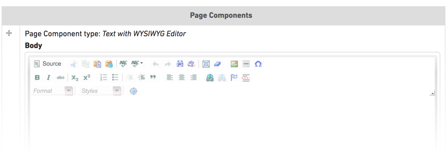
Component — Text with WYSIWYG Editor
This component should feel somewhat familiar to you — this is the same as the main body area of the Basic Page content type. An overview of how to use the WYSIWYG editor is already available, we won't review all of that here.
The best part of using this component type is that you are not restricted to just one text box. This component can be added multiple times and may appear between other components. You can also use this component above or below other components to introduce or explain the surrounding content.
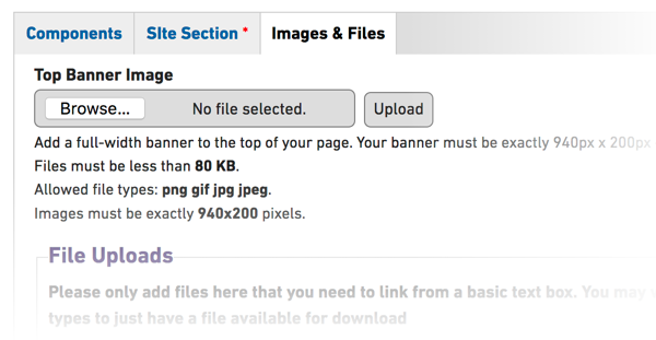
Adding Images and Files
If you would like to add files or images to use in your WYSIWYG editor box, you can add these files on the Images & Files tab of the Component Page. For more details on adding and linking to files please refer to the How to Upload and Link to a File documentation.