Use Headings Correctly
What are headings and heading levels?
A heading is a short, meaningful group of words (or title) summarizing the content that follows it. There are 6 heading levels to use as headings – heading 1 to heading 6.
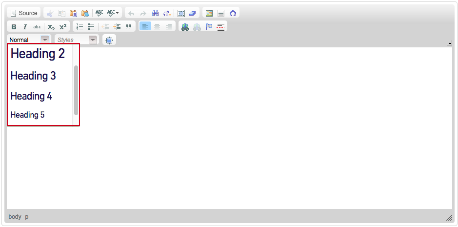
You may have notice heading levels in your WYSIWYG text editor when adding/editing content on Tyndale’s website.
Headings and heading levels analogy
Think about a single webpage as a book and it's table of content.
- The book's title is Heading 1.
- The chapter titles are Heading 2.
- Subsections of the chapters are Heading 3.
Putting this in the web context:
- The page's title is Heading 1.
- The page section's titles are Heading 2.
- Subsections of the sections are Heading 3 and so on.
Why is it important to use headings correctly?
Headings logically outlines the page
Headings separate content into meaningful sections. This helps users understand, digest, retain, and reference what they read.
Headings help sighted users scan
Sighted readers often scan a page and read the headings first to find out what information it contains. They may then read in detail only the sections they find interesting.
Headings help screen reader users navigate
The first thing majority of screen reader users do when they visit an unfamiliar webpage is navigate by heading. They are able to pull up a list of all headings on the page and jump from heading to heading to hear an outline of the page’s main ideas. They stop when they find the information they are looking for. Without headings, they have to navigate line by line.
How to use headings correctly?
Don’t skip heading levels for looks
Don't skip heading levels because you like the font size and/or colour of a different heading level. Screen reader users will be confused and left wondering where the missing heading is when navigating a page.
Use headings in proper logical order according to your document structure. The logical order starts with Heading 1 and works down to Heading 6.
Example of proper logical order
Yearly Event [page title - Heading 1]
- Schedule [Heading 2]
- Speakers [Heading 2]
- Day 1 Speakers [Heading 3]
- Day 2 Speakers [Heading 3]
- Tickets [Heading 2]
Don’t use headings for the size and color
The web is different from print. Headings should not be used just because you want a certain chunk of text bigger, bolder, or a different colour.
Headings should only be used as headings of document sections - summarizing a section.
Use actual headings provided
Don't bold, change color, or make the text bigger to look like a heading. Use the actual headings provided to you in the WSYIWYG text editor.
While sighted users can identify headings by visually scanning pages for larger text, screen reader users are not visually able to.
So increasing the font size, changing the color, or styling it differently from paragraph text is not a sufficient cue. Screen reader users rely on actual heading markup — the HTML code that indicates a heading.
Don’t apply bold or other formatting to headings provided
The headings provided on Tyndale’s website have been styled specifically for consistency.