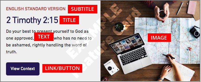
Component — Feature Card with Image
Feature Cards are single cards that will be display across the entire width of your content area. There are 3 Feature Cards — a Feature Card with an image, a Feature Card with text only and a Feature Card with a set of links. We will be looking at the Feature Card with an image in this tutorial.
» View some Feature Card examples
Creating Your Feature Card with Image
Your Feature Card will be composed of a number of parts. You will add these parts individually and then we will put them together for you to create the card.
Feature Card Image and Alternative (ALT) Text
Feature Card images can be uploaded like any other image. Your image will be displayed centred both left to right and top to bottom in your Feature Card. Your image may look different depending on the width of the screen it is being displayed on.
Using landscape oriented images works best. You can upload any image up to 10mb in file size, your image will automatically be resized to work well inside your Feaature Card.
Please make sure you remember to add descriptive alternative text to your image. This text will be used by screen readers, search engines, or when the image cannot be loaded. For guidelines on writing good alt text, please see the documentation on adding alternative text for images.
Image Order
You will have the option to have your image display on the left (default) or the right side of your Feature Card. When your Feature Card is viewed on a small screen (like a phone) it will appear as a vertical card and the image will always be above the text.
You may want to try the image on both sides to see what looks best.
Feature Card Title and Subtitle
You have the ability too add both a title and subtitle to your Feature Card. The main title should be short and clear. The subtitle is optional and appears above the title as smaller red text and is displayed in all capital letters.
Feature Card Text
Your Feature Card text needs to short and to the point — this field is limited to 200 characters. The text that is in this field is just plain text, you will not be able to add any styling or links.
Button (link and title)
If you would like, you can add a button to your feature card. The button is created from two pieces of information — the URL (website address) you are linking to, and the text you would like on the button. Please make sure you add the full URL which includes “http://…” — it is easiest to navigate to that page and then copy the URL from the address bar of your browser. It is best practice to test all of your links before you submit your page for review.
The text for your button title should be clear and short. This field is limited to 40 characters.