How to Create a Button Link
Buttons are links that are styled in a way to look like a button. Buttons should only be used when linking to another page – not just as a way to emphasize text.
Creating a Button
Creating a button is fairly simple if you follow these steps:
- Type in the text for your button
- Highlight that text and create the link
- Click on the “Styles” dropdown list in the WYSIWYG editor
- Choose the button style that you would like to use — there are multiple colours and sizes available.
Here are the details…
1. Type in the text for your button
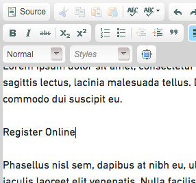
Type the text for the button you wish to create on its own line in the website editor box (WYSIWYG editor). ex. “Register Online”

2. Highlight that text and create the link
Highlight the text you have just typed and select the link button in the WYSIWYG editor. This will bring up the link dialogue box. In the URL field, enter the URL (address) of the page you wish to link to. (see more details on creating links)

3. Click on the “Styles” dropdown list in the WYSIWYG editor
Make sure your text is still highlighted and then choose the “Styles” dropdown list in the WYSIWYG editor.

4. Choose the button style that you would like to use
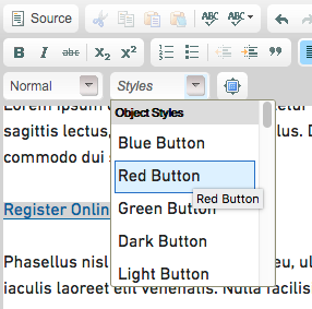
From the Styles dropdown list, you will be able to select the type of button you would like to use. These button styles are only available when you have a link selected, so please make sure you create the link first. You can select button style from a text-based list, you will not see the style reflected in the dropdown.
Here are some of your options:
Blue Button, Red Button, Green Button, Dark Button, Light Button and White Button. These are also available in large and small sizes.

After you select your button type, your button will appear in the WYSIWYG editor and the button will be linked to the URL you set in step 2.
Tips on using buttons
- If you want to create two buttons side by side, type in both and create the links for both before selecting the button styles. You will also want to select the button style for each one individually.
- Buttons are great, but too many buttons can become confusing quickly. Using one or two buttons on a page is fine, but using more than that can look bad and take away from impact of the key links. When everything looks important, nothing is important.
- Use buttons for important action links that you want to stand out - for example, the registration link for an event.
- Make sure the words on your button are clear and concise. Using long words or phrases does not tend to work well. Never (I repeat never) use the words “Click Here” for your button text (or any link really) — use meaningful words. (I really do mean never!)