Create a Basic Webform
In this help document:
- Create a webform
- Add fields to your webform
- Field types and their options
- Receive form submissions by email
- Form settings
- Publish your form and view/download submissions
- Video tutorial
The Webform content type is used to create a form that website visitors can fill out and submit to you. Two common ways that the webform could be used are RSVP/registration for an event, or as a contact form for questions/comments. Any time you need to collect information from users, Webform is your friend.
This page will help you create a basic webform. If you need something more complicated, please contact the webteam for help.
Create a webform
First, log in to your account at tyndale.ca/user. You will be directed to your My Workbench page. Or, when already logged in, click the “My Workbench” link in the footer.
-
Click the “Create content” tab at the top of the page, then the Webform link on the Create Content page.
-
Give your webform a title
- If desired, put some content in the Body field. This will show up at the top of your form, and may include information and instructions to your users related to the form. For help with adding and formatting content in the Body field, see:
-
Select the correct Site Section for your webform. More information on Site Sections
-
Your webform may need to be placed in a site menu. If so, refer to the documentation on creating menu links
-
Create a URL for your webform. How to create URLs
- Click “Save” at the bottom of the page.
The only required fields to save the webform are the Title and Site Section. To edit the Title, Body, menu link, or URL at any time, click the “edit” tab at the top of your webform.
Add fields to your webform
Now you can begin adding fields to your form. Click the “Webform” tab at the top of the page. You will see this screen:
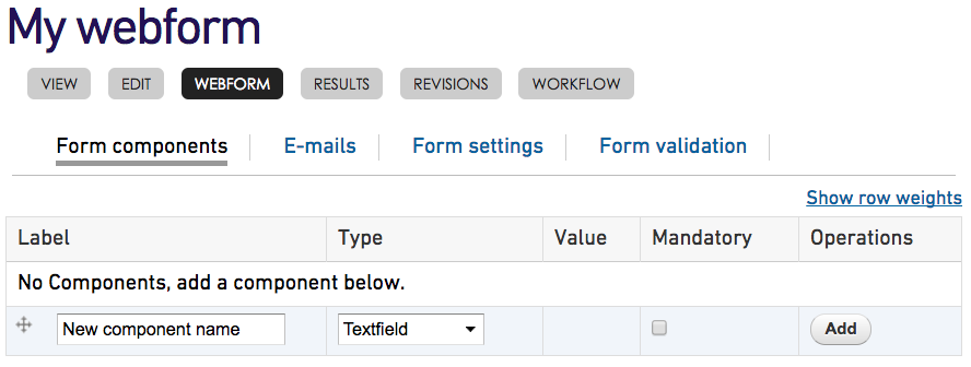
Components are the elements of your form, the fields that users will fill out. You need to add one or more to have a functioning form.
-
To add a new component, enter the component name. This name will be the label that displays next to the component. For example, if you are creating a textfield for the user’s name, you might call it “Your name”.
-
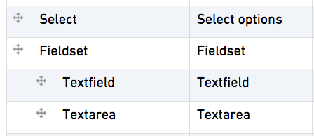
Choose the component type. Below are the component types you will most commonly use; if you need more complicated forms, contact the webteam for help.
-
A textfield is a one-line text field. You use it for collecting shorter information, such as a user’s name or street address.
-
A textarea is a larger, multiple-row field where users enter larger pieces of text, for example, comments or questions.
-
E-mail is used for collecting email addresses. You should use this rather than a regular textfield when asking the user for an email address.
-
Select allows the user to choose from a pre-created list of options. For example, in an RSVP, you might give users the choice of a beef, chicken, or vegetarian entree.
-
Fieldset is a collection of form components. It doesn’t do anything in itself, it is just a grouping of form fields, with a heading or label at the top. An example would be an “address” fieldset, with textfields for street address, city, and postal code; and a dropdown select list for province. These fields would then be grouped together with the “address” label at the top. You likely won’t need to often use fieldsets, but they can be useful for grouping fields in longer forms.
-
- The “mandatory” checkbox, if selected, makes that form component required. The user will not be able to submit the form without filling out that field. Not all form elements need to be required. You should select this for any essential component without which the purpose of the form can’t be fulfilled.
- For example, on a feedback form, you could allow the user to leave their name blank if they wish to remain anonymous, but make the “Comments” textarea required.
- On the other hand, if you are taking registrations for an event for which you’ll need to check the person’s identification, you might make the “name” field mandatory.
- If you’re accepting requests for information to be mailed, you would likely make all essential address fields required.
- Also on this screen, you will notice that each component has a cross with arrows on the four points to the left. You can click and drag these crosses to rearrange the components. You can move them up or down, or if you have included a fieldset, you can drag them below and indented to the right of the fieldset to make them part of the fieldset. Once you’ve rearranged a component, you must click the “save” button at the bottom to preserve your changes.
-
When you’ve given the component a name and chosen the type, click “add”. You will be taken to a form where you can set some additional options. Most of the options you probably won’t need to change, but a few can be useful.
-
For any form component, you can add a “description”. This text will show up below the field and can be used to provide users with instructions on filling out the field.
-
You also have the option in the edit form of the component to set it to Mandatory
-
Field types and their options
Below are some component-specific options:
Textfield
-
Maxlength limits the number of characters a user can enter in the textfield. For example, if you’re collecting a postal code, you could limit the field to 7 [characters] (allowing for a space in the middle). Most of the time, it won’t be necessary to use this.
-
Width is the on-screen visual width of the field. Again, the number you enter here corresponds to the number of text characters wide the field will be. Most of the time the default width is fine, but you may want to lengthen or shorten it depending on the data which will be entered. To use the postal code example again, you could limit the width to 7 [characters] as a visual cue to the user. (Note that changing the width does not change how much text the user can enter; you need to use maxlength for that).
-
Prefix text is optional text which will show up to the left of the textfield; postfix text will be placed to the right of the field.
-
Label display: you can choose the label to display to the top or left of the textfield, or not to display at all. Most of the time, you won’t need to change this option.
Textarea
-
Again, you can set a width for the textarea. Most of the time, you should leave it at the default width.
-
Height controls how tall in rows the textarea will be. Again, the default is usually fine.
-
By default, the textarea is resizable by the user. It’s a good idea to leave this, as it allows the user to make the textarea bigger in order to see more of the text they’ve entered.
The email component type looks like a textfield, but adds some extra options. For example, it checks if what is entered in this field appears to be an email address, and offers hints to the user if it doesn’t. The user won’t be able to submit the form unless what they’ve entered is formatted correctly.
You can also select the “User email as default” option to pre-fill the field with the user’s email address, if they are filling out the form as a logged-in user of the website.
Select options
The select option component allows the user to choose from a pre-entered list of options. For example, if you are holding a training event on three different dates, you could allow the user to indicate which date he will attend.
-
Multiple: the options will be presented as checkboxes instead of radio buttons, and the user can select more than one.
-
Options: the list of options the user will choose from.
- Each option must be put on a separate line
- The first part of the option is a key, which the user won’t see. It should be brief, unique, and only contain letters, numbers, and underscores (no spaces).
- After the key, enter a pipe character | (usually under the delete key on your keyboard, above the backslash)
- Then enter the human-readable option. This is the part that the user will see.
For example, with the RSVP menu options example we mentioned earlier, the option list could look like this:
beef|Roast beef with mashed potatoes and sweet corn
chicken|Chicken marsala with green salad
veggie|Vegetarian pot pie
-
Listbox - this presents the options as a drop-down list rather than radio buttons or checkboxes. This can be useful if you are offering a longer list of options, so as not to take up too much space. It’s not the best idea to use this option along with the “Multiple” option, because users will have to press the Ctrl or Command key to select more than one option, and that’s not as intuitive as being able to select checkboxes. However, if necessary, you could present instructions to the user on how to do this in the “Description” text.
-
Randomize options presents the options in a random order, rather than the order you enter them. This is probably not usually necessary.
Fieldset
Occasionally, if you have a longer form, you may want to group the components together into subsets. You can do this with fieldsets. An example we mentioned earlier might be an “address” or “personal information” fieldset, which includes fields like user’s name, street address, city, telephone, etc.
-
To create a fieldset, add a new component of type “fieldset”. The name you give it will appear as a label above the group of fields.
-
To add components to the fieldset, create the components, then in the “Form components” screen of the Webform tab, click and drag the cross to the left of a component so it is below the fieldset name, indented to the right:
- Alternately, when editing any component, click the “Position” link (just above the “Save component” button at the bottom), and click the “Parent” drop-down box. If you have created any fieldsets, you can select one here to add your component to it. Then, to move it up or down, you can either increase or decrease the “Weight” number under “Parent”, or, back at the Form components screen, you can click and drag the arrow cross to rearrange it.
Receive form submissions by email
Often, it’s convenient to receive an email notification when someone has filled out your form. To set this up, click the Webform tab, then the E-mails sub-tab. In the Address field, enter your email address (or the address of the person receiving the email), and click “Add”. You can enter more than one address, separated by commas.
This will bring you to a screen where you can customize the email options. Most of the time, leaving these at the default settings is fine, but there may be times you’ll want to change them.
-
Subject: here you can customize the subject line of the emailed forms. The default is “Form submission from: [Your webform name]”, but you can enter a custom subject if you wish.
-
Email from address: the default is webteam@tyndale.ca. If you have asked the user to enter their email address in the form, and if you need to reply to the user, you can change this to be the user’s email. This will allow you to hit “reply” in your email client and reply directly to them. Select the “Component” radio button, and if you have an “email” component in your form, it will be selected automatically. If you have more than one email component, click the drop-down list and select the correct one.
-
Email from name: the default is Tyndale, but if you have asked the user to enter their name in your form, you can select “Component” and select the user name component. The emails will then show as coming from the name the user has entered. Note that the user name component has to be a textfield.
The rest of the settings should not need to be changed. Click “Save e-mail settings” at the bottom to preserve your changes.
Try filling out and submitting the form to check that the email is working. If it doesn’t show up in your inbox, check your spam.
Form settings
Under the Webform tab, you will also see a “Form settings” link. There are a few useful settings here:
-
At the top, you will see a “Confirmation message” field. You can use this to write a message that the user will see after he/she has submitted the form. This can be an acknowledgement that the form has been submitted, that you will respond to the user, further instructions, or whatever you like.
-
Per user submission limit: there may be instances where you want to limit the number of times a particular user can submit the form. Usually you should not need to do this. However, if you wish, you can set the number of times each user can submit the form, and the time period: ever, every hour, every day, every week. So for example, you could set it to “Limit each user to 1 submission(s) every week”.
The rest of the settings on this page should be left at default. Remember to click “Save configuration” when you’re done.
Publish the form and view submissions
Your webform is now ready. But it won’t be available to users of the site until a member of the webteam approves it. To submit the form for approval, click the “edit” tab at the top, scroll down almost to the bottom, select “Ready for Review”, then click the “Save” button at the bottom. Or, you can click the “Workflow” tab, select “Ready for Review”, and click “Update workflow”. More information on content approval
Once your form has been approved, users can start filling it out. If you’ve set the form up to email submissions to you, you should receive notifications. To view all user submissions, go to your form while logged in and click the “results” tab. This will show you all the submissions your form has received. You can click the “View” link to view any one in full. You can also download the results.