Component Pages
Component Pages are a new content type that allows content creators to build content pages in a new way. These pages are made up of a number of individual components. These components can then be ordered on the page in any order.
Components are essentially predesigned patterns that work well on both mobile devices (such as phones) as well as tablets and traditional computers. These components have also been built with accessibility in mind to help you produce accessible content easier.
Here are some examples of the components available for you to view:
Creating a Component Page
To create a Component Page, log in with to the Tyndale website with your user account. You will be directed to your “My Workbench” page. Or, any time while you’re logged in, click the “My Workbench” link in the site footer.
At the top of the page, click the “Create Content” tab.
On the next page, click the “Component Page” link. This will take you to the create/edit form for your new content.
The Component Page form will look a little different from the typical Basic Page edit form. Here is a screenshot of what you will see.
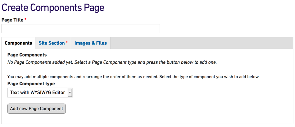
The form is separated into multiple tabs. You can click on any of the tabs to view the form fields available.
Components
 This is the main tab for adding content to your Component Pages. Each component you add will be stacked vertically in this tab. Components can be reordered by dragging the reorder icon (+) on the top-left of each component.
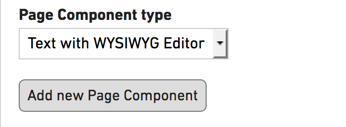
To add a new component you can select the component you wish to add and then click on the button below the select list.
» View documentation on adding components
Site Section
This tab will allow you to choose which site section for your content. This is the same as in a Basic Page but will appear in a tab rather than below all the other content. * Please note that this is a required field.
Images & Files
This tab hold fields for adding images or files to be used in the “Text with WYSIWYG Editor” component. You will only need to add files here if you are requiring them for this component type.
You will also be able to add a Top Banner Image to your page. This image will appear below the main menu and above the title of your page. Images must be sized to 940 pixels wide by 200 pixels tall. Refer to the How to crop and resize images documentation if you need help getting your image to the correct dimensions.
Adding Components to your page
This documentation covers the basic creation of a Component Page — additional documentation is available for each individual Component type: